Danky Donuts

Role
UI/UX designer
Client
Danky Donuts
Project type
WEBSITE REDESIGN
HOW MIGHT WE
redesign the website to better reflect Danky Donuts’ energetic and vibrant brand identity and create a more engaging online customer experience?
Project overview
Project overview:
Danky donuts Started as a small, locally owned donut business at San Diego farmers markets in 2009, specializing in fresh, made-on-site donuts, catering, w food truck experiences. They later Expanded to catering services and food truck operations across San Diego.
in 2020, Danky Donuts faced a problem: COVID
The bigger problem: although Danky Donuts had grown organically through farmers' markets, catering, and food truck appearances at local events. Their growth relied on word of mouth reputation from their community. Despite the brand’s popularity at events, the business lacked a cohesive online presence to sustain growth beyond word-of-mouth.


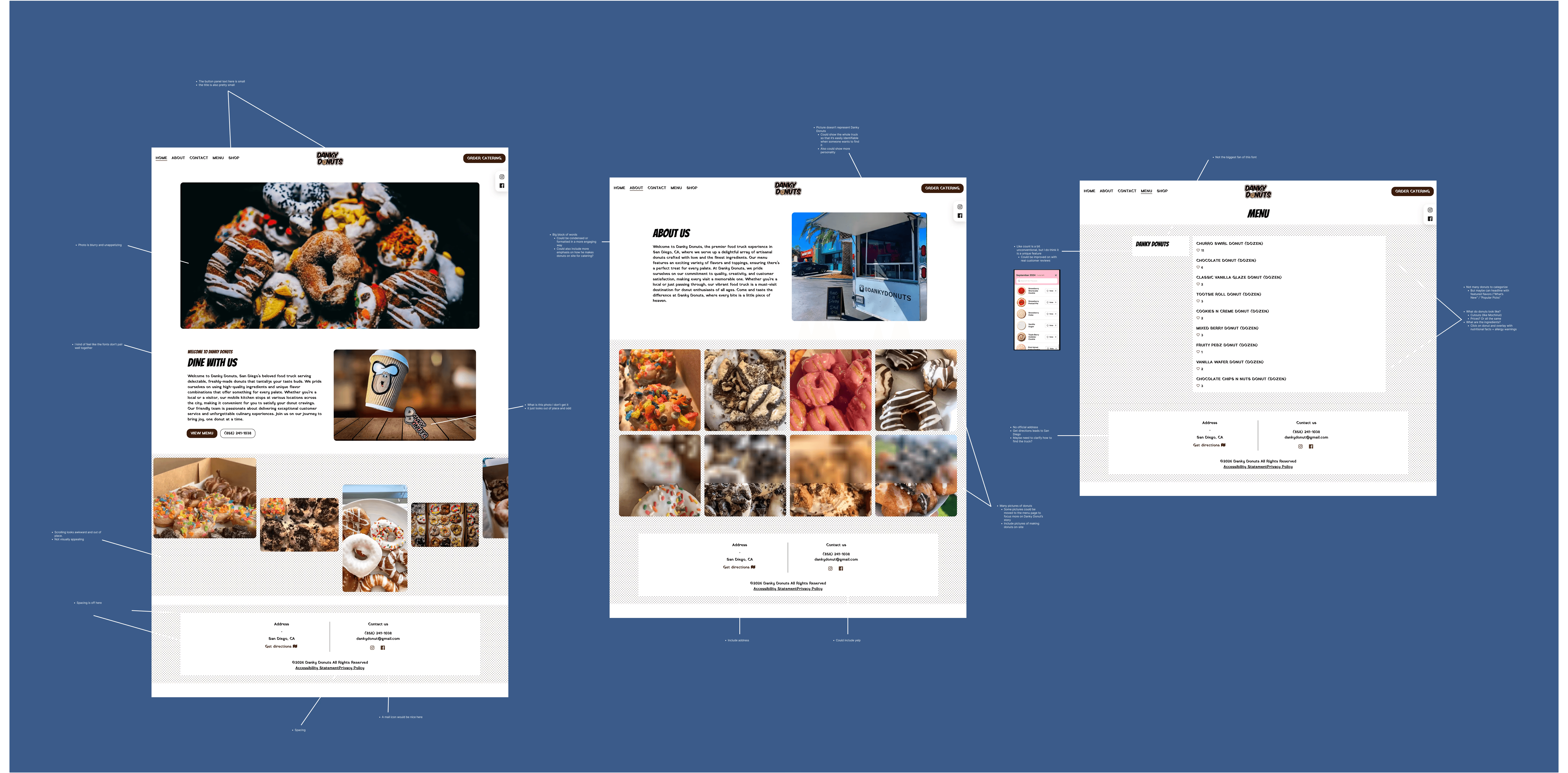
Lacked a clear visual identity, had an Unorganized content hierarchy, and failed to create an engaging User experience.
WEBSITE AUDIT &
COMPETITOR ANALYSIS


WEBSITE AUDIT AND
COMPETITOR ANALYSIS
Danky donuts
Lacked a clear visual identity
Unorganized content hierarchy
and failed to create an engaging User experience.

SOMETHING THAT STRUCK ME WHEN WE TALKED WITH RAY IS HOW EFFORTLESSLY FUNNY HE WAS. WE WANTED TO CREATE SOMETHING THAT FELT AUTHENTIC TO DANKY DONUTS' FRESH FEEL SO WE CREATED A STYLE GUIDE THAT COMPRISED OF FUN GRAPHICS, DOODLES, AND BRIGHT COLORS.
DESIGN PROCESS
WE DESIGNED BRIGHT, EYE-CATCHING GRAPHICS TO HERO THE SITE. WE ALSO CONSTRUCTED A STYLE GUIDE WITH FUN DOODLES TO SCATTER ALONGSIDE TYPOGRAPHY THAT CAPTURE THE DANKY DONUTS BRANDING.
OUTCOMES


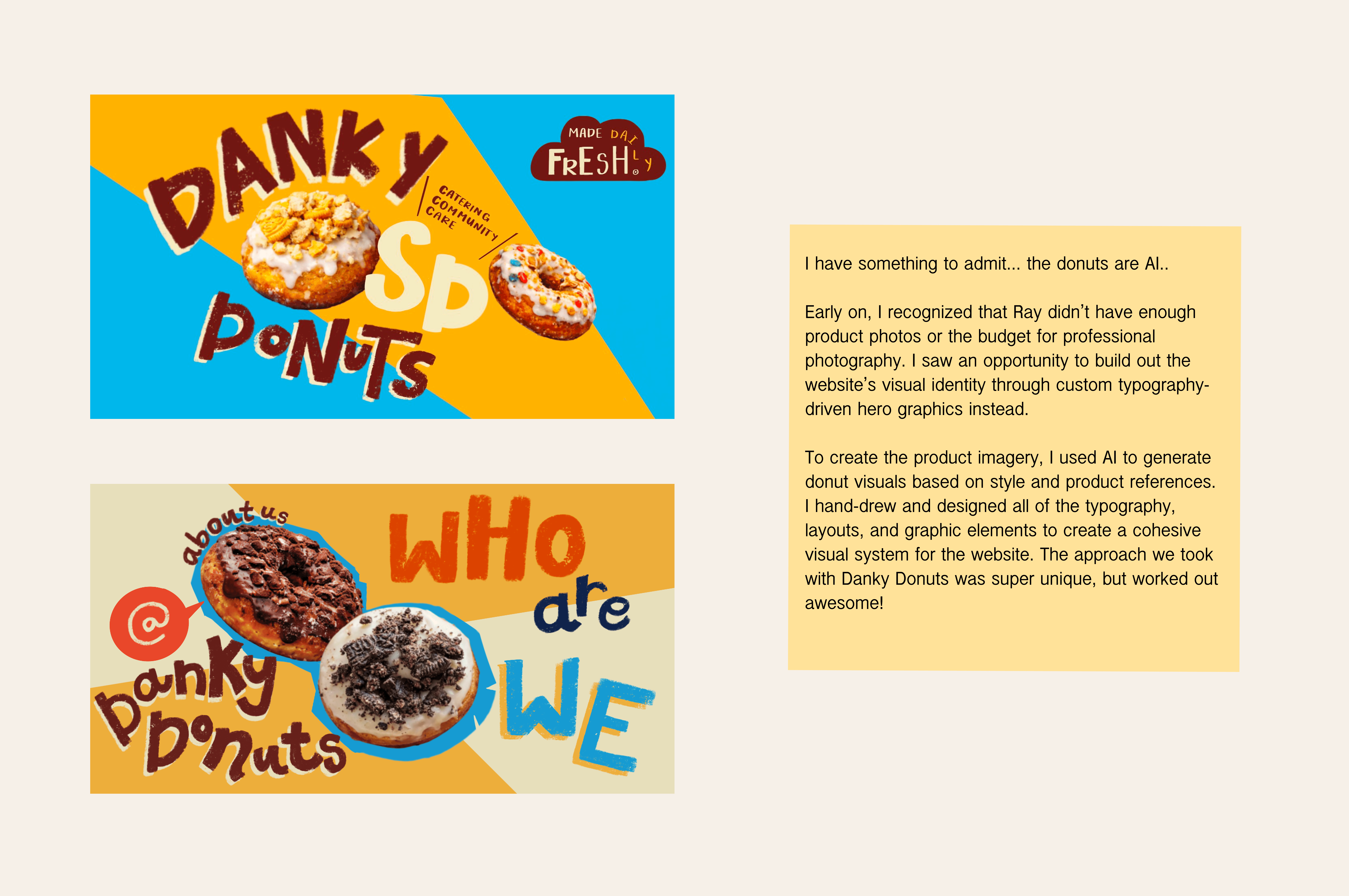
WE DESIGNED BRIGHT, EYE-CATCHING GRAPHICS TO HERO THE SITE. WE ALSO CONSTRUCTED A STYLE GUIDE WITH FUN DOODLES TO SCATTER ALONGSIDE TYPOGRAPHY THAT CAPTURE THE DANKY DONUTS BRANDING.
TAKEAWAYS

